Pyramid Diagram Template
Explain any process where many inputs narrow to a single point with the pyramid template.
About the Pyramid Diagram Template
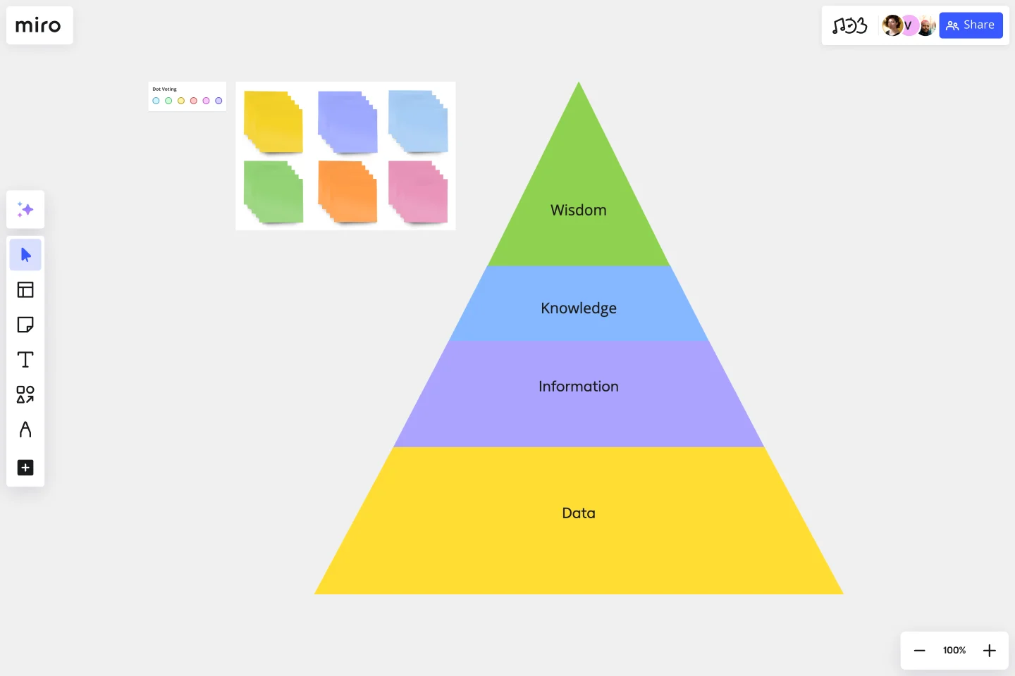
The pyramid is a profoundly symbolic shape. If you’ve ever heard of a pyramid scheme, the food pyramid, or Maslow’s Hierarchy of Needs, you know what we mean. All of those are examples of a pyramid diagram: an evergreen tool for illustrating hierarchies. Our version of the pyramid template captures that power to help you illustrate important points. A pyramid diagram is a great way to convey hierarchical relationships or processes that build toward an end goal.
What is a pyramid diagram?
A pyramid diagram, also called a triangle diagram or triangle chart, helps you depict how multiple concepts build on each other in sequence. The sequence can be anything: many inputs narrowing down to a single result, a list of steps one individual must take in order, or the philosophical underpinnings of a well-known concept.
Its format is simple. Take a triangle and divide it into sections with horizontal lines. The pyramid is normally read from the largest segment to the smallest — each section should depend on the sections below it.
How to create your own pyramid chart template
Miro is the perfect graph maker, and with the pyramid template, you can whip up a pyramid diagram with blinding speed.
Start by selecting the pyramid diagram template, then follow these steps:
Step 1: Decide on a topic for your pyramid diagram.
The best topics involve a hierarchical structure, processes that gradually narrow down a field of many inputs or seemingly simple concepts with more complex underlying factors.
Step 2: Pick your stages.
You don’t want your diagram to become too complicated, so try to limit it to a maximum of six stages.
Step 3: Place the stages in order.
Use triangles and trapezoids from our shapes library to create the levels of your pyramid. The pyramid can be upright or inverted, as long as the largest segment corresponds to the broadest concept and the smallest segment to the narrowest.
Step 4: Label and color-code the stages.
Tag each segment with a relevant label. You may want to visually distinguish each stage by giving it a unique color. Rainbow is always fun!
Step 5: Add any additional elements necessary to understand the chart.
For example, you can pull rectangles from the shapes library to post background information beside each pyramid level.
Step 6: Share your pyramid diagram with your team.
Miro lets team members collaborate, working together to create the perfect graph. It works for fully remote or hybrid collaborating teams.
Benefits of using a pyramid template
The biggest benefit of pyramid diagrams is that they’re easy to draw and even easier to understand. When looking at a pyramid, you can usually intuitively grasp what it’s trying to say. One great use of a pyramid diagram is to show how a seemingly simple concept has vast and diverse underpinnings.
For example, a marketing professional could use one to show how their product’s appeal to a certain customer segment is based directly on their customer-centric marketing strategy, their strong UX work, and, finally, on their mission statement.
It’s also an extremely useful template for education.
Common use case of a successful pyramid chart template
The sales funnel is one of the best applications for a pyramid chart. Let’s walk through what that could look like.
The largest segment of a sales funnel pyramid chart could correspond to the stage that involves the largest number of customers. Your potential customer base starts with your total addressable market then narrows to the customers in that market who have heard of your product.
A certain percentage of those customers will research your product after learning about it. A smaller percentage of them will decide that they want one. An even smaller percentage — the smallest segment of the pyramid — will act on that desire and actually buy one.
The diagram could also contain an even smaller segment for the percentage of people who become loyal repeat customers.
How does a pyramid diagram work?
A pyramid diagram organizes several concepts that depend on each other into a hierarchy. The order of the segments corresponds to the sequence of ideas or steps.
How do you make a pyramid graph?
Our Pyramid Diagram template makes it easy. Just grab the shapes you need, label them, and add any background information. It’s perfect for adding color to a presentation.
How do you read a pyramid?
Read from the largest segment to the smallest. That way, you start with the broadest, most basic idea and end at the narrow conclusion. In other words, reason from general to specific.
Is the top of the pyramid the most important?
No, the entire pyramid is important. Every segment should build on the one below and add something to the one above.
Is there a recommended color scheme for a pyramid diagram?
There is no strict rule for color schemes, but it's advisable to use colors that enhance clarity and readability. Consider using a gradient or a color scheme that aligns with your organization's branding.
How can I customize a pyramid diagram template to match my presentation style?
You can adjust the template colors, fonts, and sizes to match your presentation style. Ensure that any customization maintains clarity and doesn't compromise the understanding of the diagram.
Get started with this template right now.
Bull's Eye Diagram Template
Works best for:
Diagrams, Project Management, Prioritization
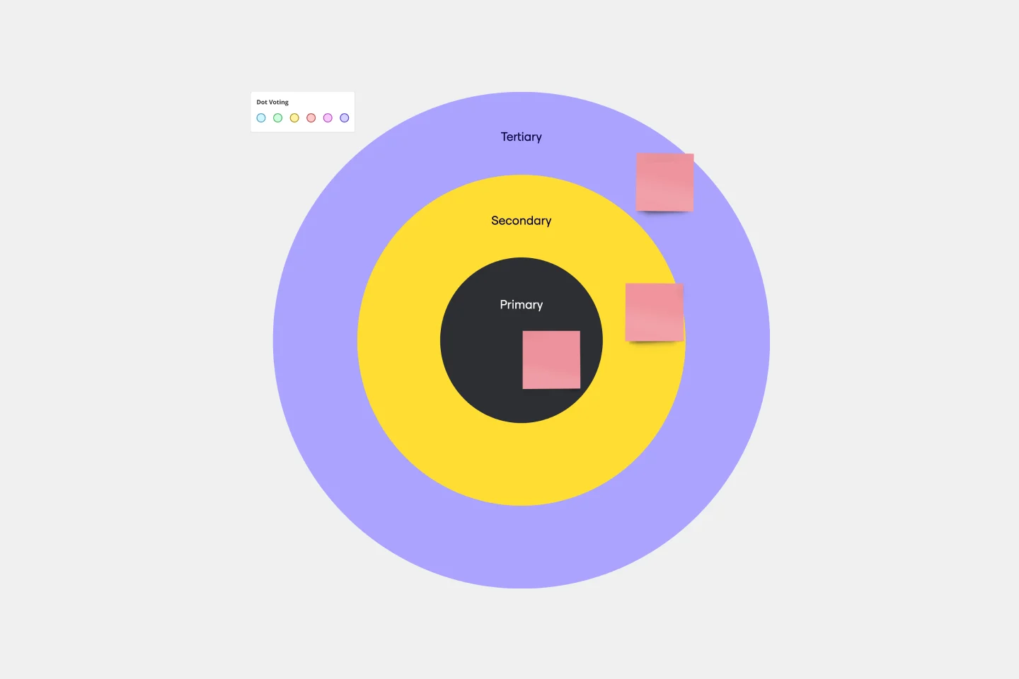
When you’re a growing organization, every decision can feel like it has make-or-break consequences—which can lead to decision paralysis, an inability to prioritize, inefficient meetings, and even low morale. If that sounds like you, put a Bull’s Eye Diagram to work. True to its name, a Bull’s Eye Diagram uses a model of concentric circles to help companies establish priorities, make critical decisions, or discuss how to remove or overcome obstacles.
Action Priority Matrix Template
Works best for:
Mapping
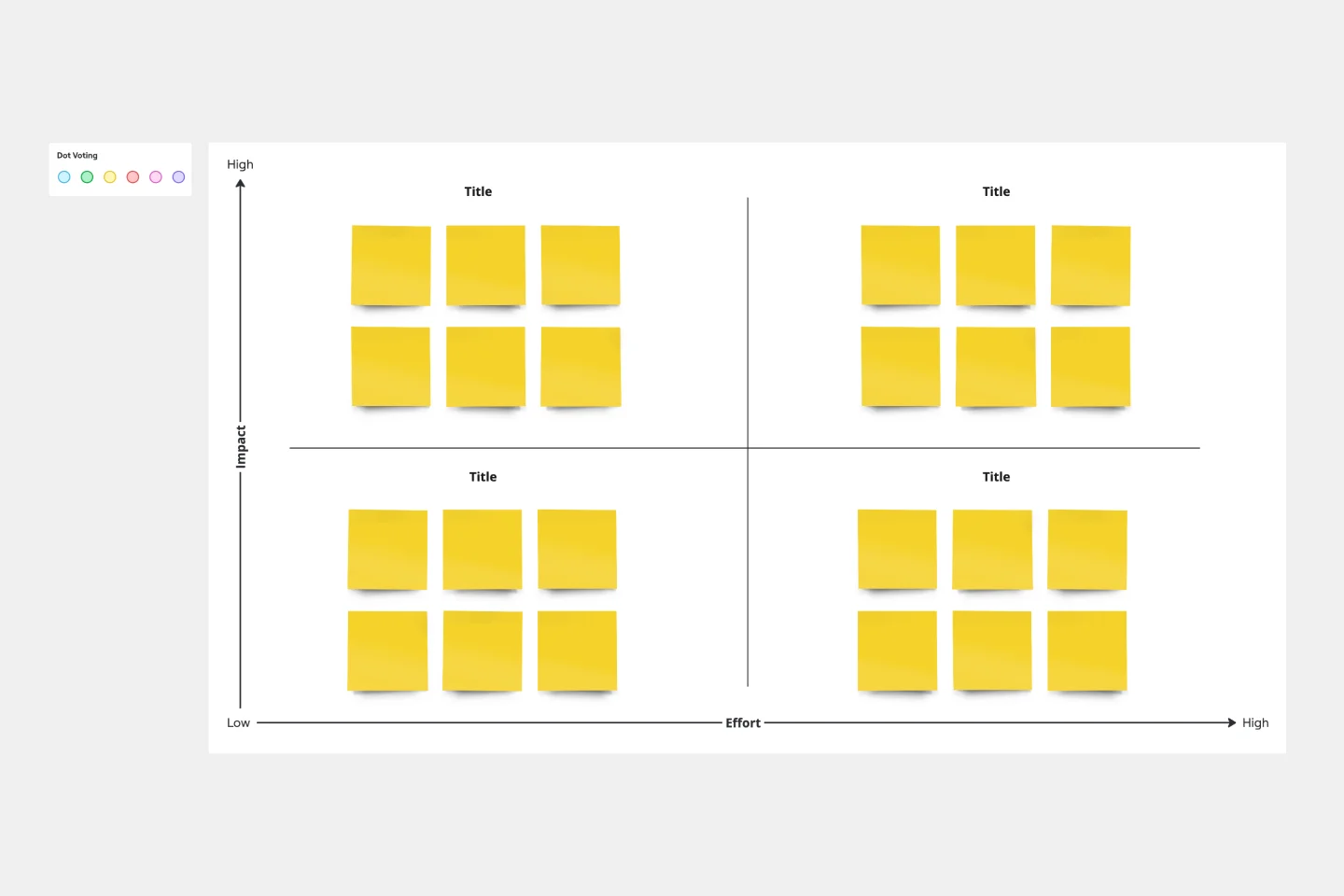
You and your teammates probably have more ideas than resources, which can make it difficult to prioritize tasks. Use an Action Priority Matrix to help choose the order in which you will work on your tasks, allowing you to save time and money and avoid getting bogged down in unnecessary work. An Action Priority Matrix is a simple diagram that allows you to score tasks based on their impact and the effort needed to complete them. You use your scores to plot each task in one of four quadrants: quick wins, major projects, fill-ins, and thankless tasks.
Mitch Lacey's Estimation Game Template
Works best for:
Leadership, Agile Methodology, Prioritization
A wordy name but a simple tool, Mitch Lacey’s Estimation Game is an effective way to rank your work tasks by size and priority — so you can decide what to tackle first. In the game, notecards represent your work items and feature ROI, business value, or other important metrics. You’ll place each in a quadrant (ranking them by size and priority) to help you order them in your upcoming schedule. The game also empowers developers and product management teams to work together and collaborate effectively.
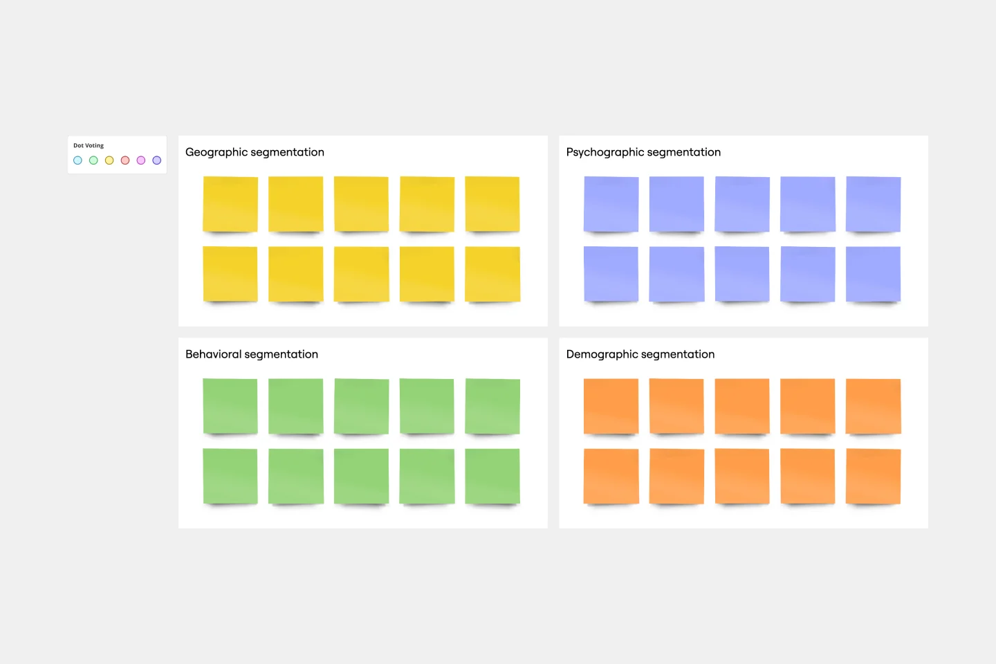
Market Segmentation Matrix Template
Works best for:
Marketing, Strategic Planning, Product Management
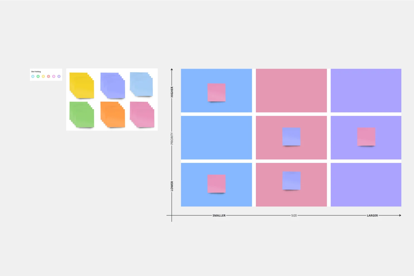
Successful, compelling marketing begins and ends with knowing your audience — who they are, where they are, and what they want and expect. A market segmentation matrix will help you understand them on a deeper level. This business tool divides your target market into subsets based on demographics, geography, needs, interests, psychographics, or behavioral characteristics. You can then use these insights and data to hit it out of the park, by building better product, sales, and marketing strategies. Our template lets you set up and populate a Market Segmentation Matrix with ease.
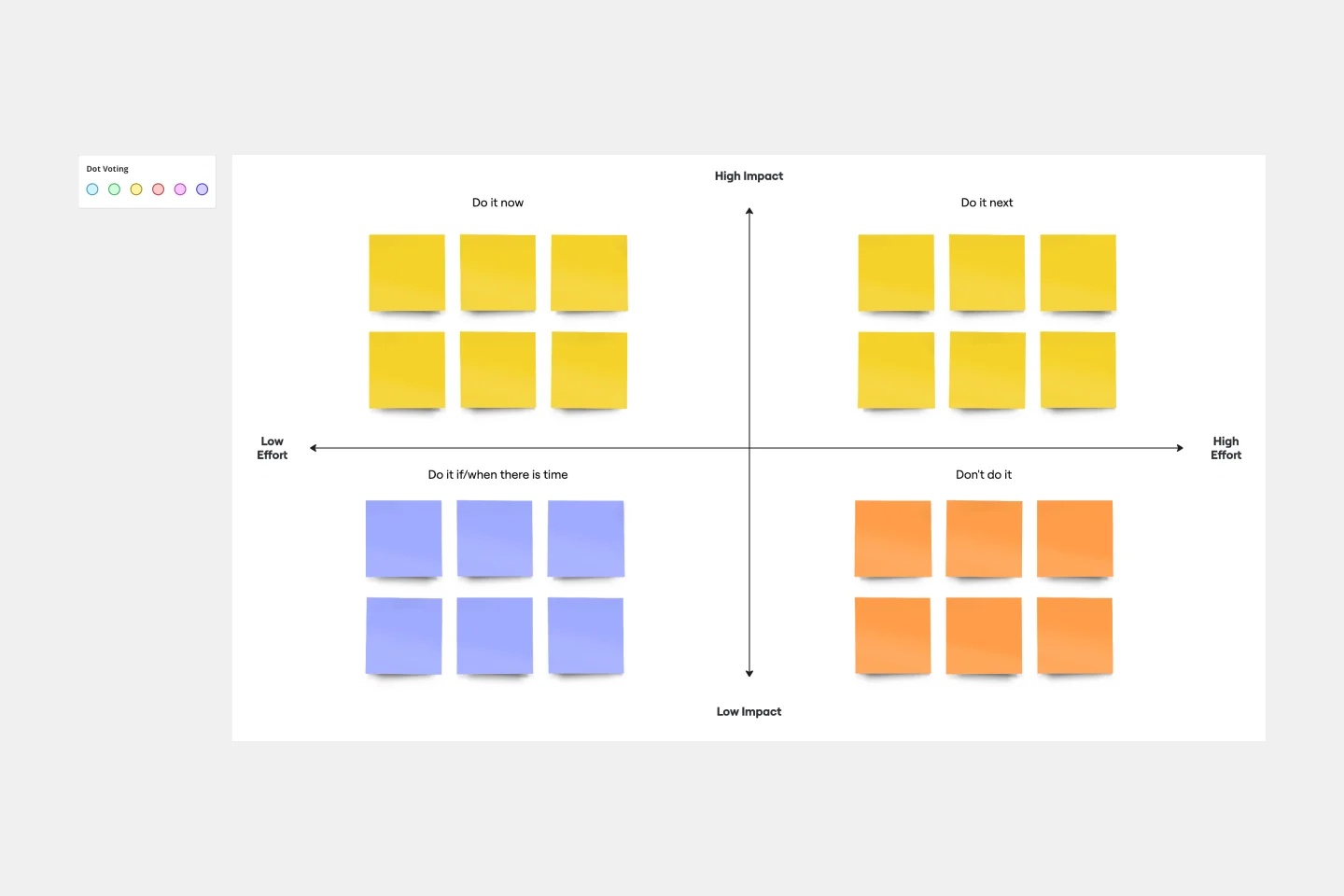
Impact/Effort Matrix Template
Works best for:
Project Management, Strategic Planning, Prioritization
Growing organizations have countless to-do’s and only so many hours in a day (or weeks before a big launch) to get them done. That’s where an impact effort matrix comes in. It gives you a quick visual guide to help prioritize your tasks and know exactly what’s worth doing. Using our template, you can create a matrix that organizes your activities into four main categories: quick wins that are low effort, effort-intensive projects that provide long-term returns, fill-ins that are low effort but low value, and time-wasters.
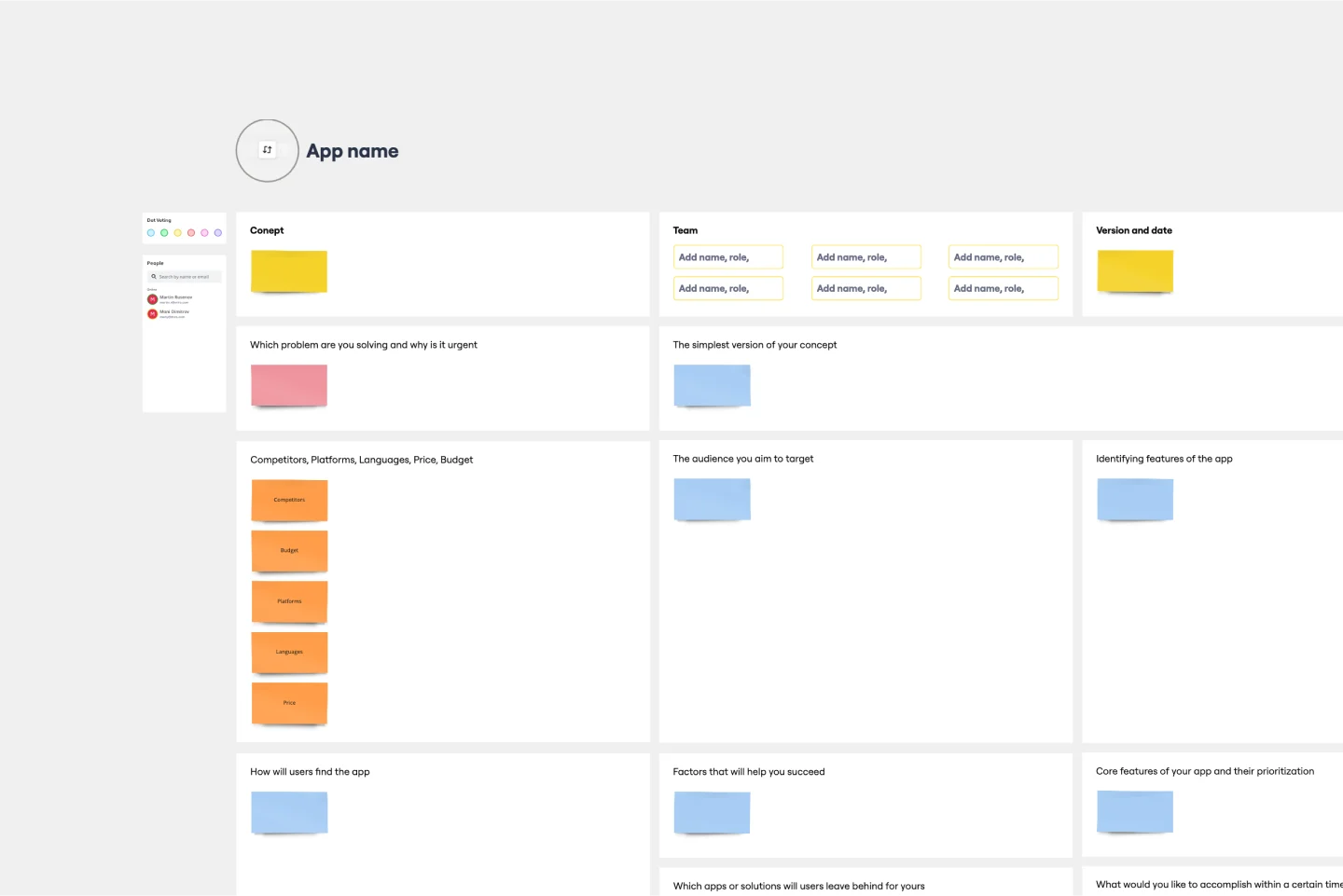
App Development Canvas Template
Works best for:
Market Research, Product Management, User Experience
Ever noticed that building a successful app requires lots of players and moving parts? If you’re a project manager, you definitely have. Lucky for you, an app development canvas will let you own and optimize the entire process. It features 18 boxes, each one focusing on a key aspect of app development, giving you a big-picture view. That way you can fine-tune processes and get ahead of potential problems along the way—resulting in a smoother path and a better, tighter product.